Stott & Atkinson Photography
Brief
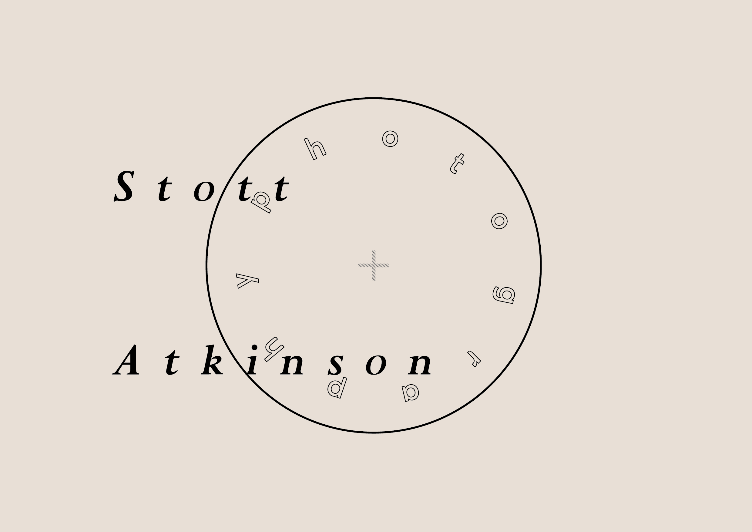
Wedding photographer's Paul and Tim wanted a basic identity and collateral refresh using elements from there old logo to influence the rebrand placing there contemporary approach to documenting moments into a traditional area.
Problem
Keep the use of a circle and the +, while trying to emulate a contemporary feel within the brand to change the perception of traditional wedding photography while still focusing on drawing in a range of ages.
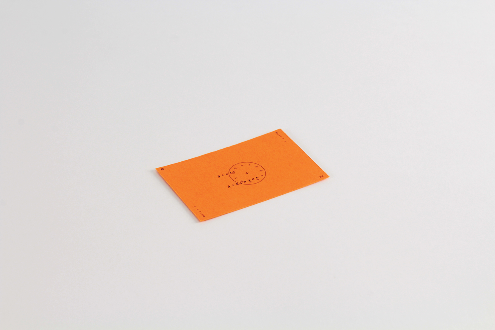
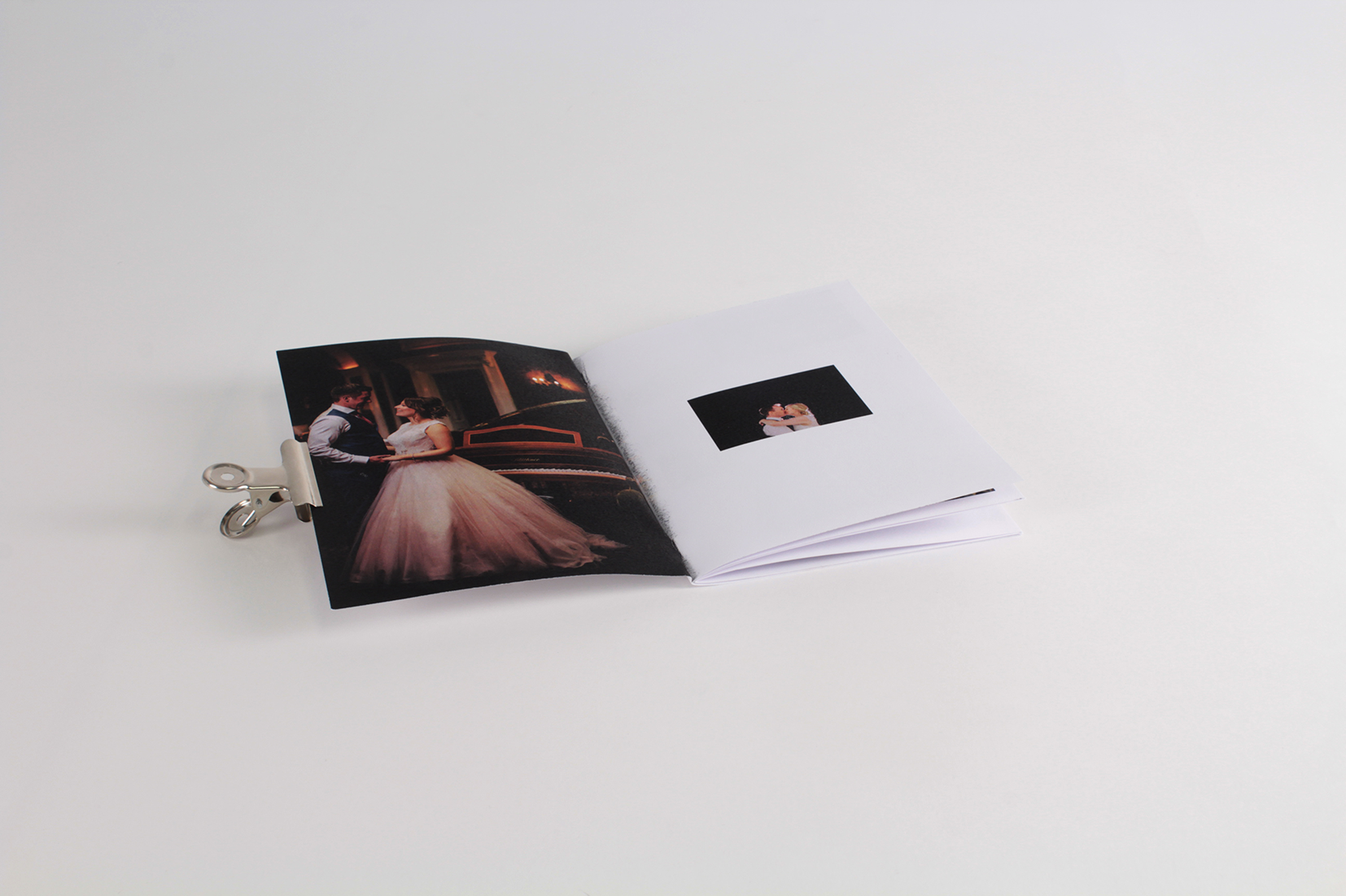
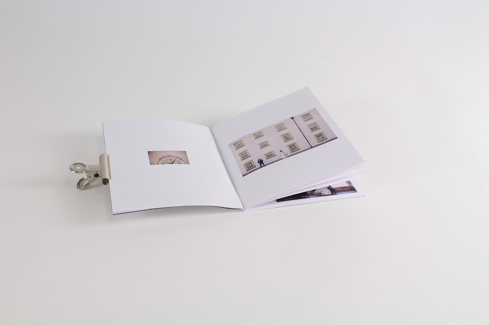
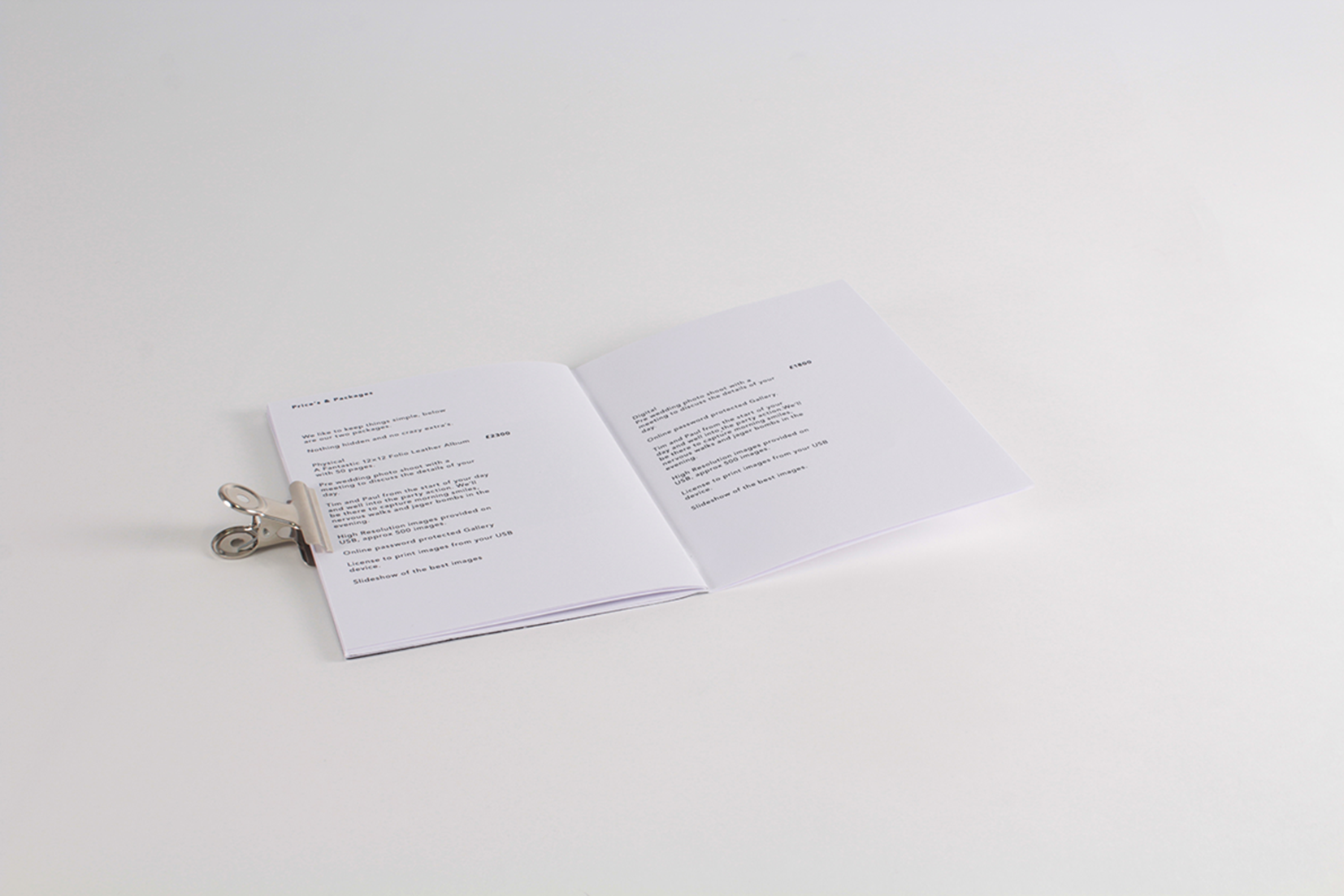
Figure out what simple and cheap collateral can be made to provide as a keepsake and to communicate the potential services of Stott & Atkinson.
Solution
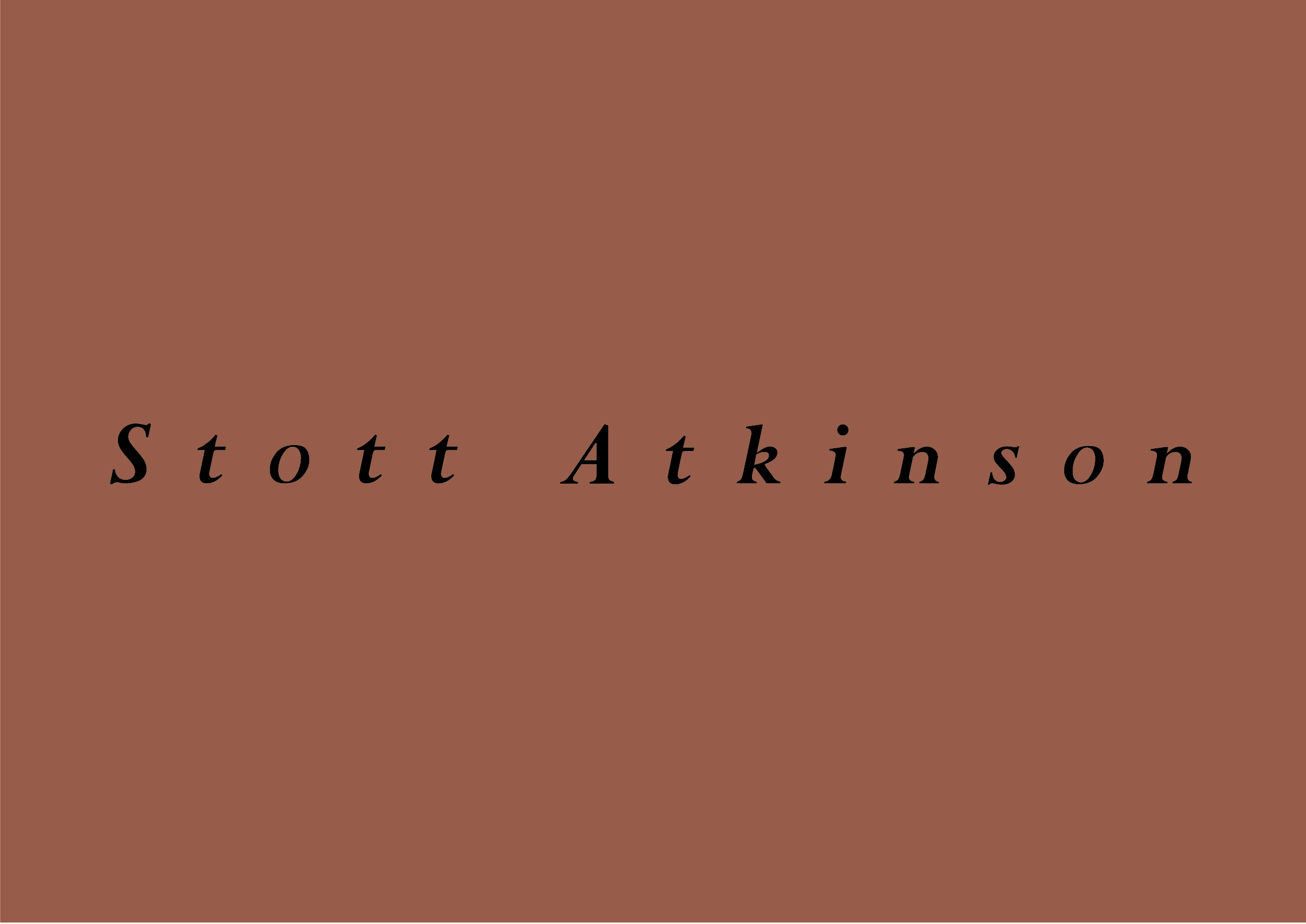
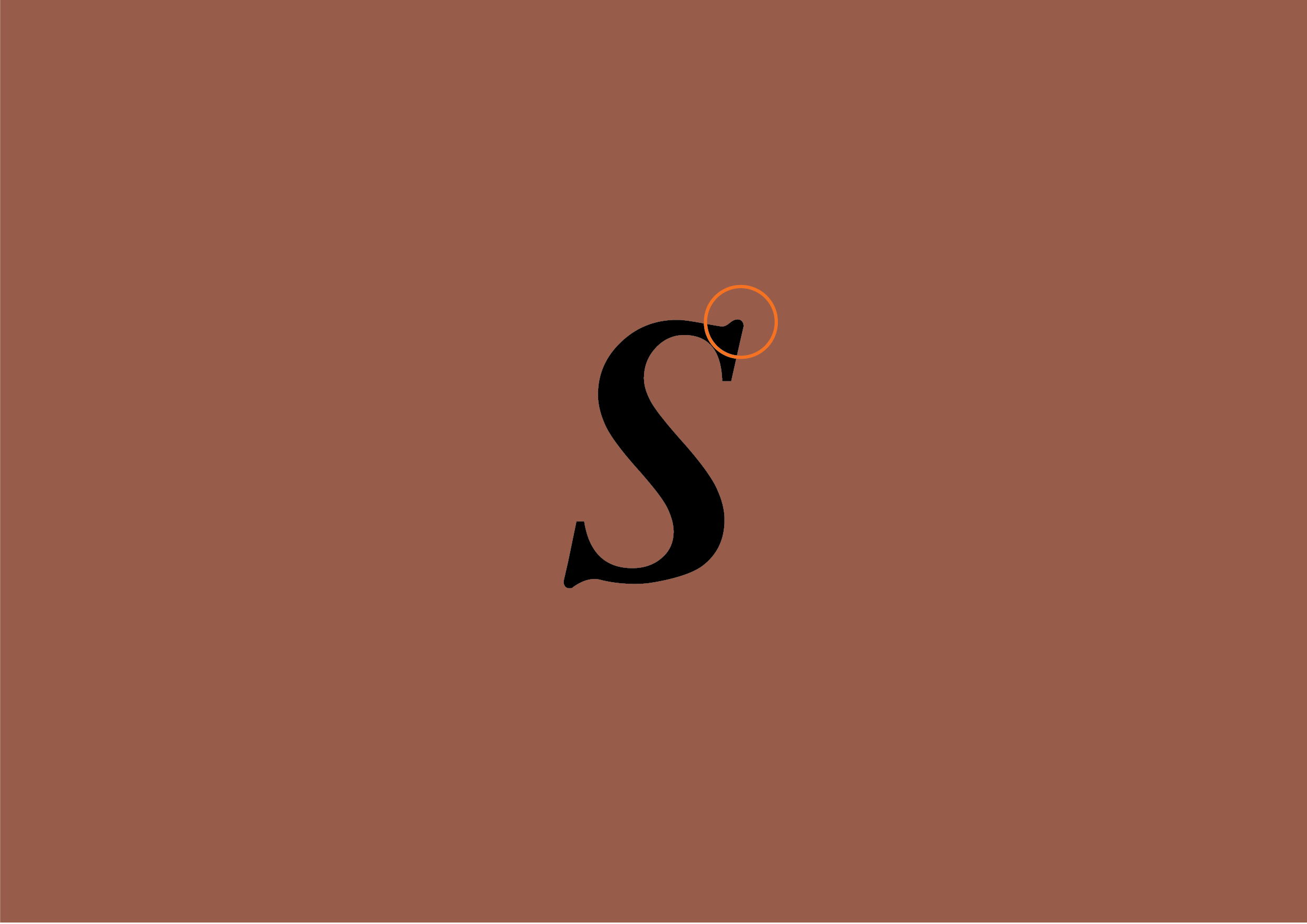
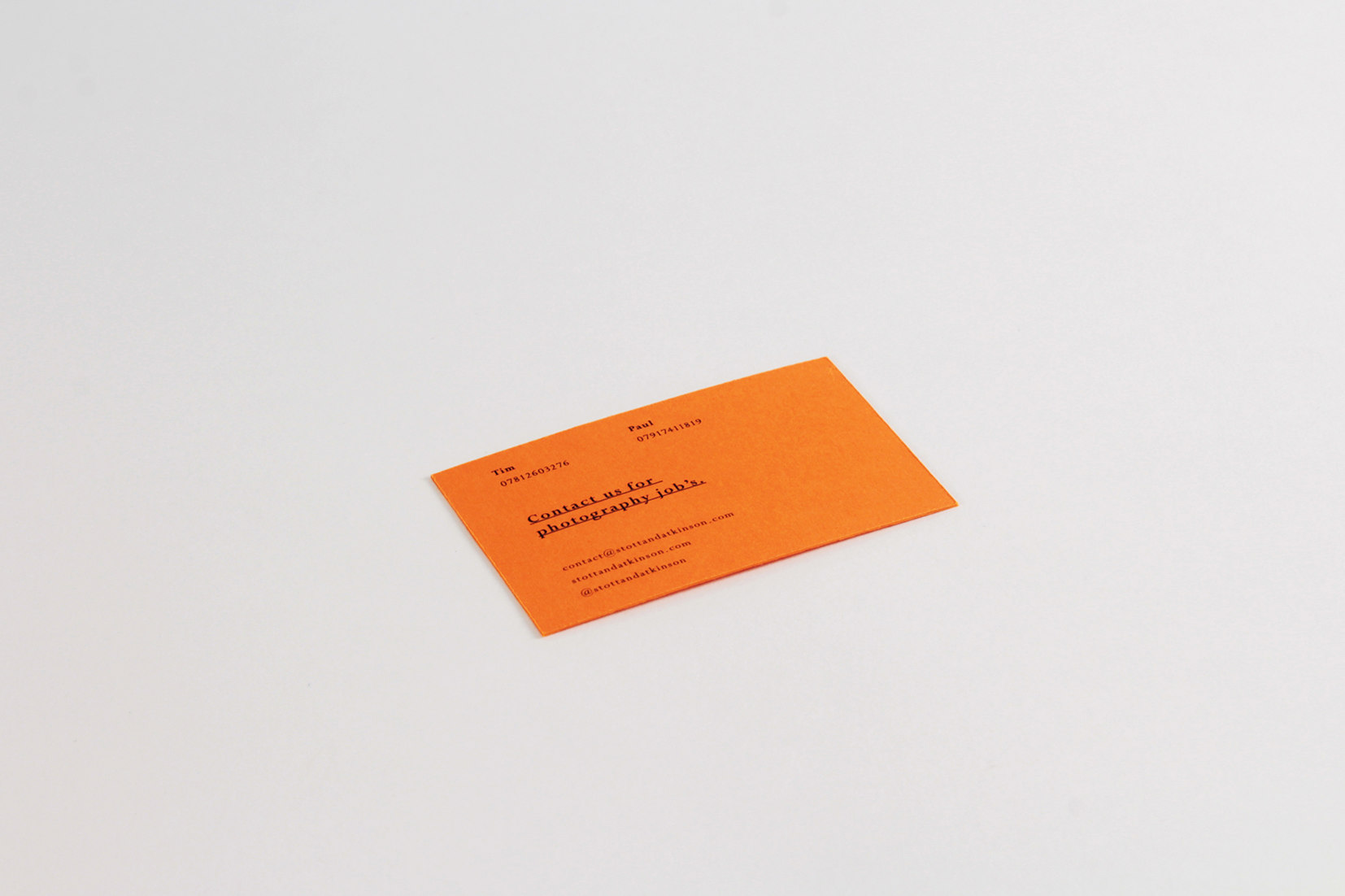
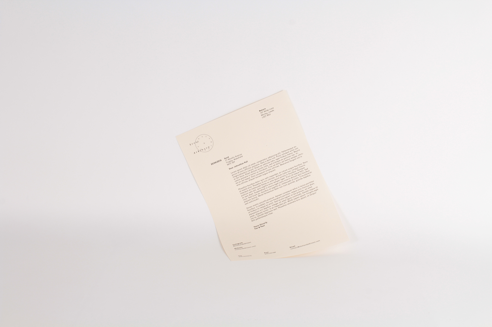
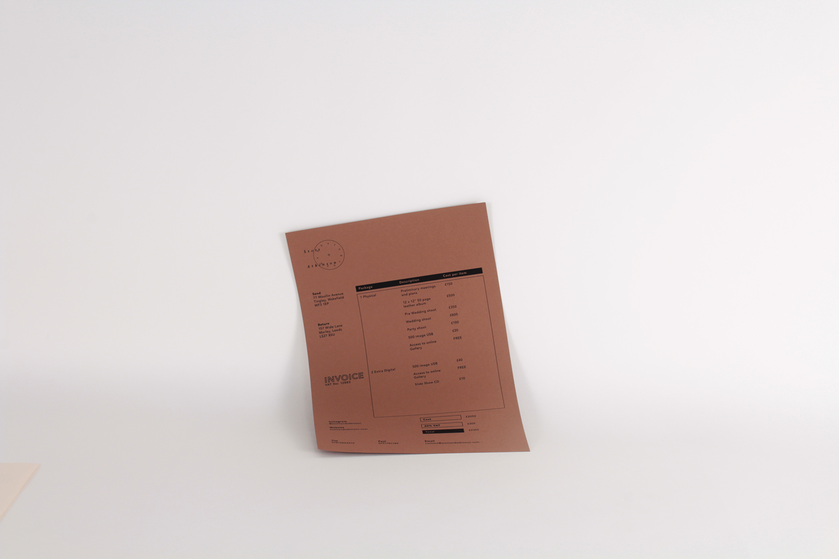
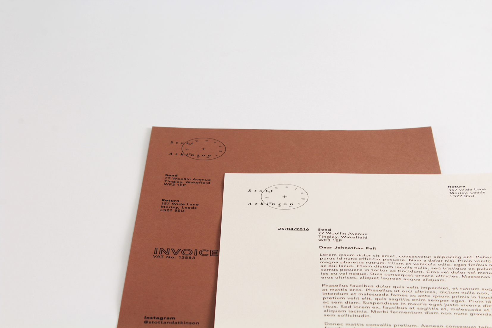
The use of the circle and plus was expanded with the addition of other basic camera icons within the brand. The main logo focus uses a custom soft traditional serif face with the use of a geometric supporting sans face to merge the traditional with the contemporary.
The collateral makes use of the bright and neutral tones to further expand on this merging of the traditional and contemporary while the zine offers a keepsake and a snapshot of services that can be easily updated and reproduced on a home printer.